You have a Distinct Element Style from all the rest!
Find out how this advantage can work for you. Take my quiz to find out more!
Take the quiz now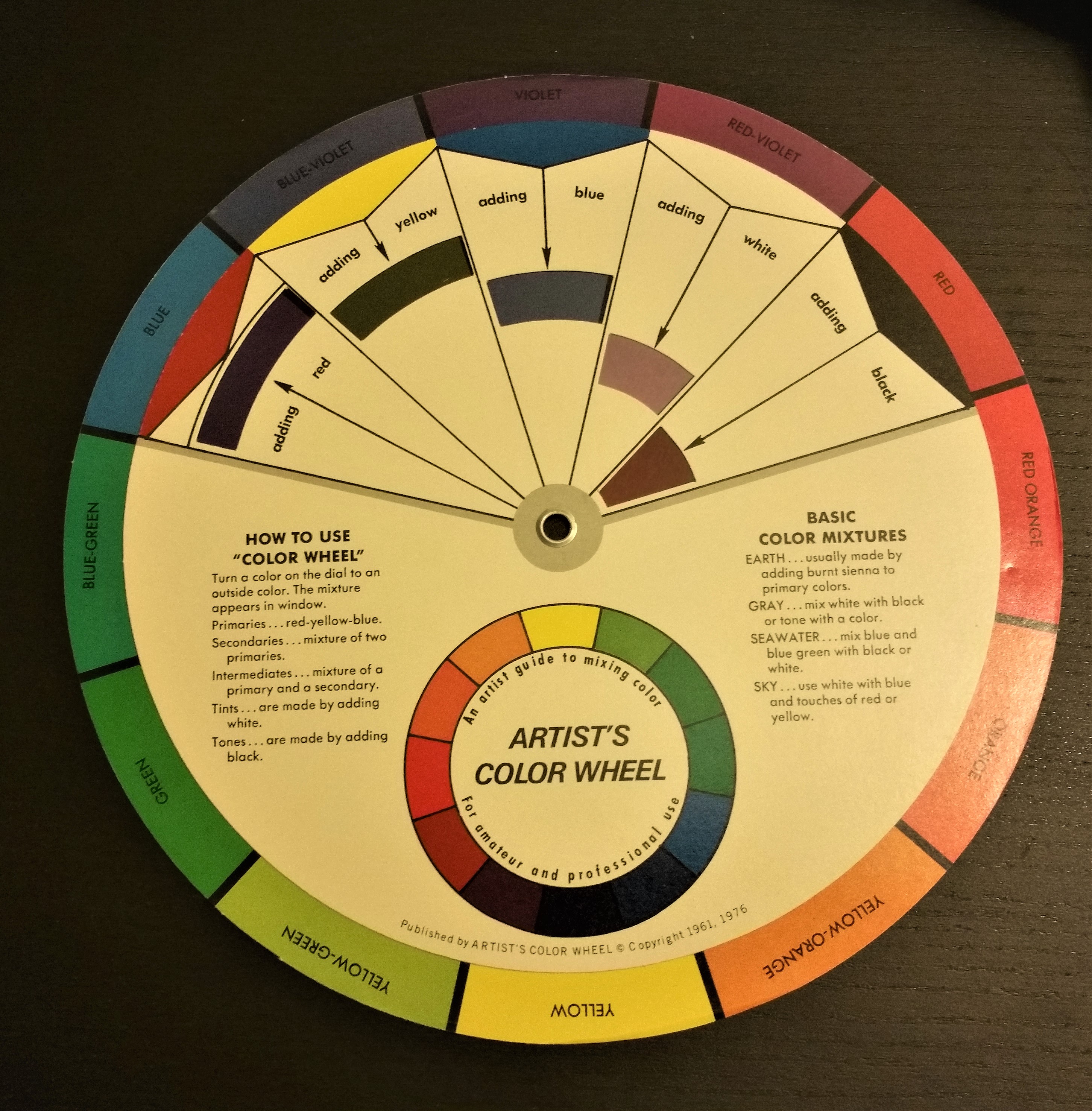
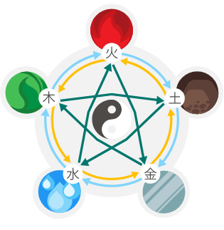
A Color Wheel helps you see how the colors relate to each other.
A GREAT COLOR has the potential to make our day. It can bring positive attitude, confidence and joy when used properly in your home!
Colour relates to our psyche and changes from season to season; it can affect our mental health. Ever wonder why you liked something one week, and hated it the next? Well, the energy keeps changing in our lives.
I worked many years as a paint consultant. During a home visit, I would evaluate the customer’s needs through items that were already present in their space. Sometimes, I felt like a marriage counsellor, trying to find the happy medium in decorating styles. Many times, the couple was happy and enthusiastic picking out paint and all the fun accessories; and the next day, barely talking to another.
-So, what happened?
Choosing a paint color is one of the cheaper transformations, but for many do-it-yourself-fixes –it is not that easy. Make sure your colours/floors/draperies will all fit together with the bigger plan, and schedule enough time to finish the job.
A little splash of colour goes a long way. Be practical. If everything in the house is a ‘WOW’, the tone of your house will be very busy!
Choose quiet colours for quiet rooms.
See –Colour wheel
To choose a GREAT COLOUR for you, let’s first look at the colour groups:
PRIMARY: red, blue and yellow. Primary, because they are bright and young kids can recognize these colours first. Use these colours to move people thorough the house, accent something or draw attention to the area.
SECONDARY: green, orange, purple. A 50/50 blend of only two of the primary colours, these colours act as a transition into another colour. Different ratios, of course, will allow creating all the variations of colour.
MONOCHOMATIC: Same colour, different hues. Looking at the colour wheel and selecting 3 or more colours adjacent in the same section.
OPPOSITES: These are colours directly across from each other on the colour wheel. Together, these colours give you extreme contrast. Often used in marketing or signage, using one primary colour and one secondary colour can give your message the best ‘punch’ per dollar. Even the ‘holiday references’ use these smart combinations. Examples: Xmas colours are green and red. Easter colours are yellow and purple.
A colour palate is a group of colours chosen to work together within your space; consider existing accents colours for flooring, cabinets, build-ins and fireplaces, as well as lighting and function. When choosing a colour pallet for your home, select no more than three colours to set the tone as this allows for the best function and flow.
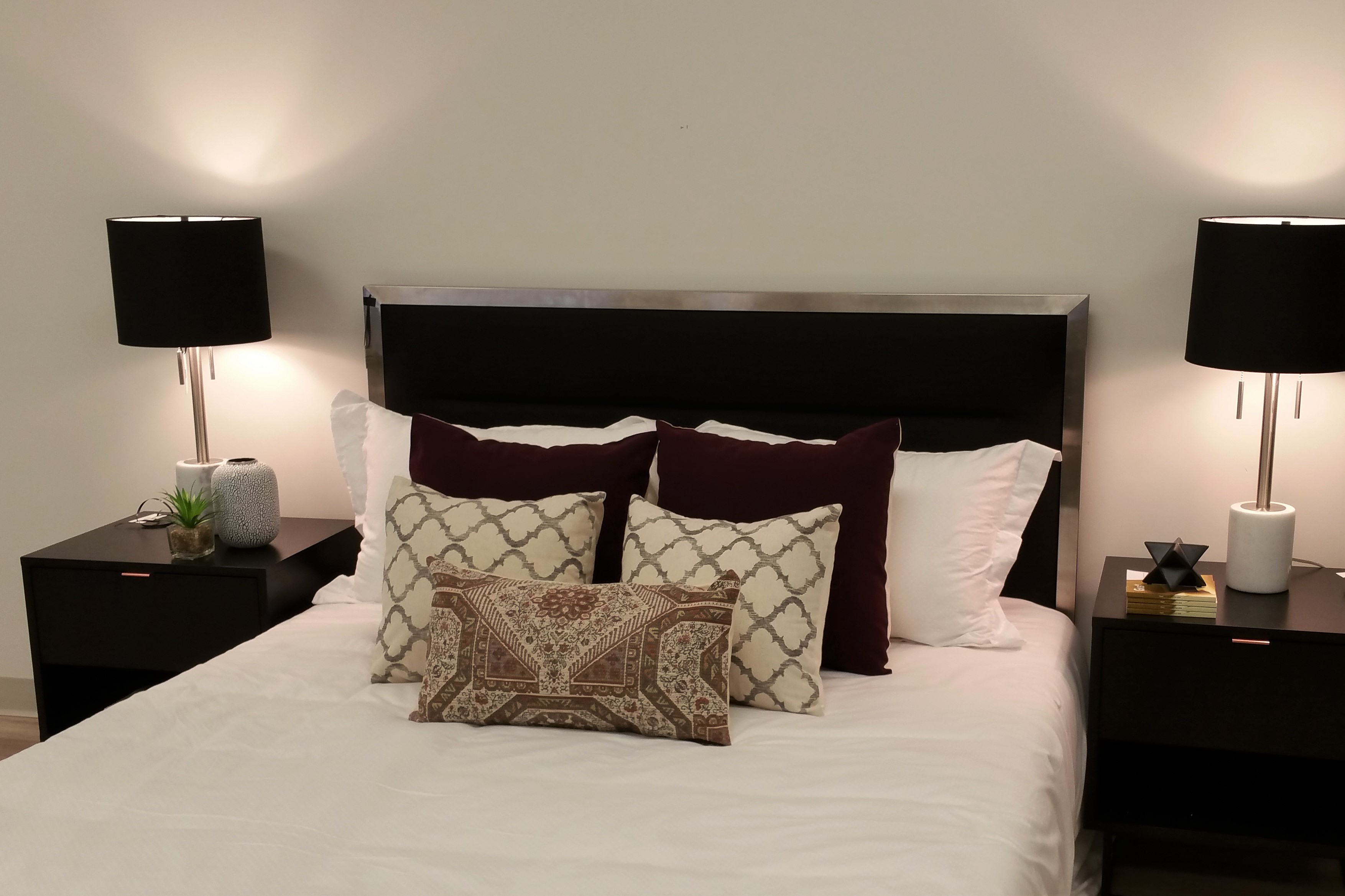
A colour palate for common areas will flow thorough the entire house; while bedrooms can embrace an individual palate, as it is considered private space.
For example: A common area may feature carefully chosen beige, grey and white colours for ‘fixed items’: walls, carpeting or window coverings. Choose wisely when purchasing large items, as these mistakes can be costly to change.
Then, select an accent colour, perhaps turquois. (Please don’t paint your living room turquois!) This accent will be referred to when shopping for pillows, vases and images for the walls; you’ll consider base colours along with the accent colour. This accent colour can also show up in other small details throughout the home; on tea towels, bathroom towels, curtain trim, placemats, flowers and such. You may even like a ‘secondary accent colour’ (silver or copper) to bring into the mix!
This is your space!
So, the bottom line is: If you are Staging your home to sell or re-sell down the road, choose neutral colours and pair with trendy accent tones.
If you are planning to find function and flow in the space where you wish to live, the choice is ultimately up to you.
~ Whatever the choice, the colours you bring into the home should make you happy!
Wish to have a chat with kathryn? No charge for 30 minutes. No pressure. Just insight to help you BE the best in life.
Email me a note: kathryn@kathrynwilking.com
Enjoy the journey, Kathryn
~ Here are more ideas for bedrooms I found in my travels:
Adult Master bedroom; soft earth tones don’t have to be boring.
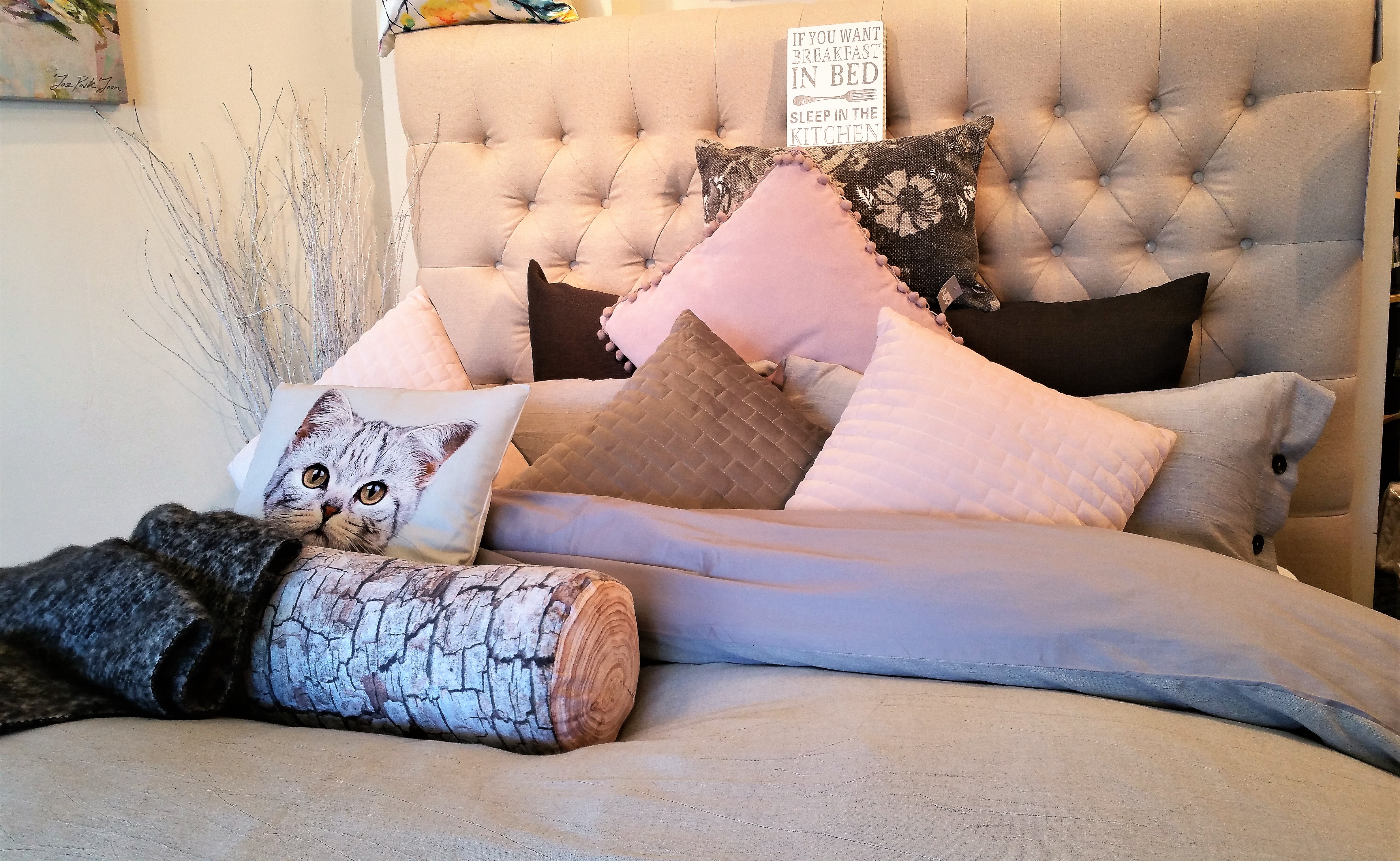
A little whimsy brings joy and comfort to the room.
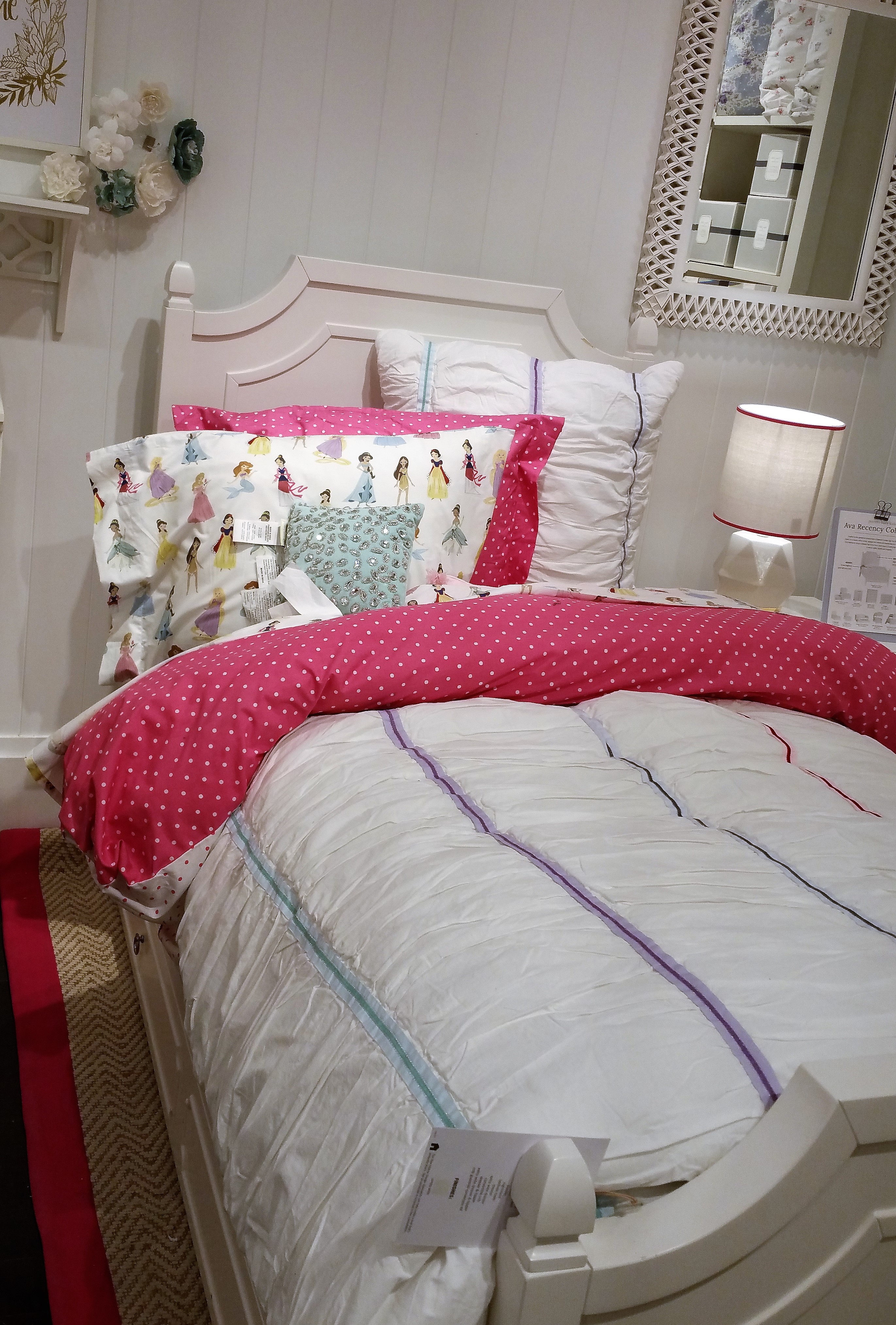
A child’s bedroom needs to have personality, yet quiet enough to fall asleep.
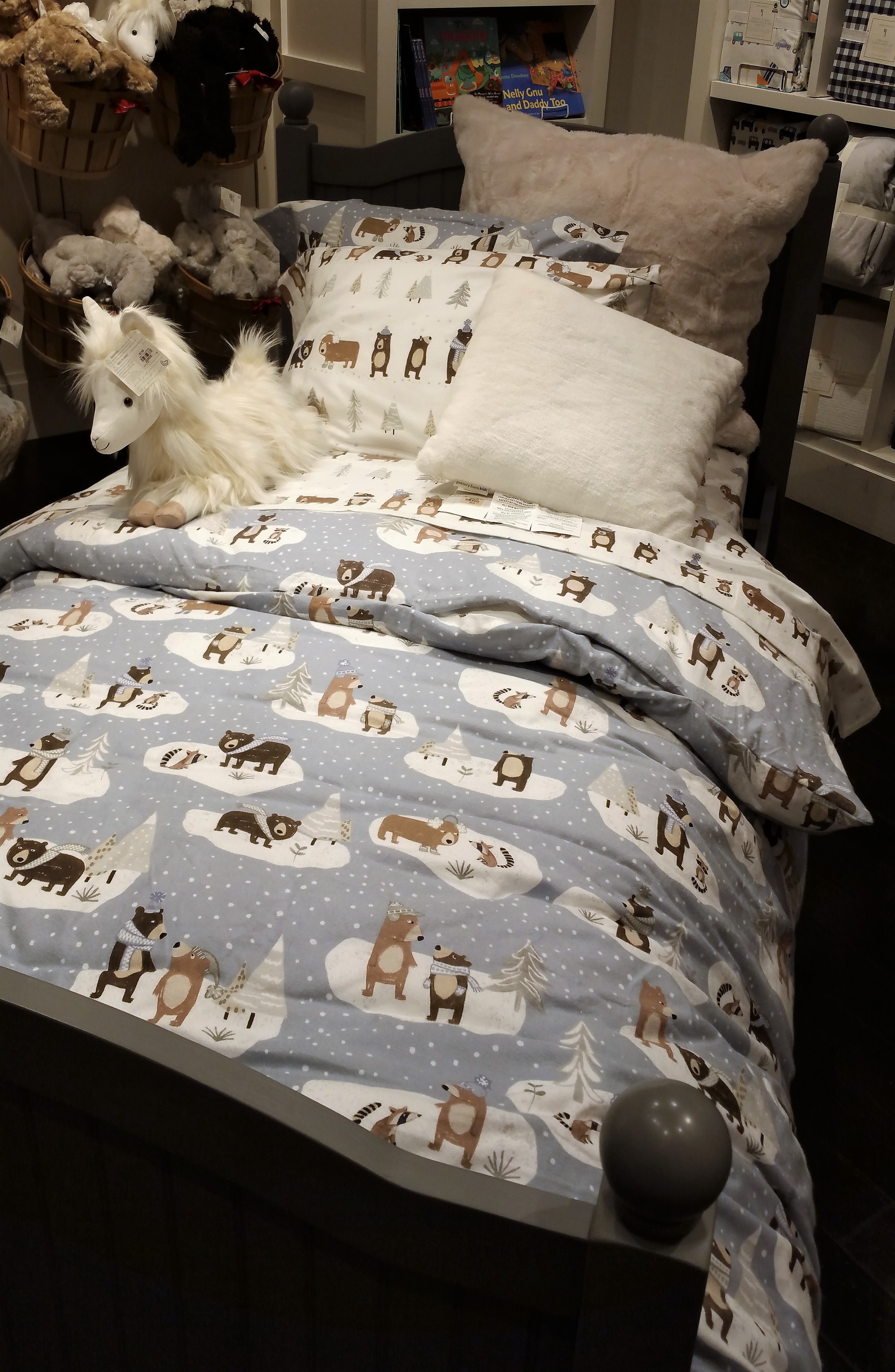
Boys will be boys; they will sleep easier with quieter colors and soft materials.
Enjoy the journey, Kathryn
** Kathryn Wilking is an Author, Home Stager and a Feng Shui Consultant. She delivers “practical solutions to life’s problems’.
Kathryn has a gentle way of manipulating energy to help find balance and flow in each situation. You can trust her with your concerns. Contact her for a chat to find out how feng shui can help you!
Kathryn@kathrynwilking.com https://www.kathrynwilking.com
Kathryn is available for lively talks and workshops. She’s also developed a unique system through Skype, to help YOU be the best you can be. Together we can all make the world a better place. Call to book your appointment today!

Kathryn has inspired women for more than a decade to take charge of their lives; arranging their environment, home and office, to support a positive, prosperous lifestyle. She provides informative tips and talks to organizations and small groups through her Facebook Group and Blog Posts and recorded podcasts. Contact her today for more info about bringing the practical application of Feng Shui into your space.
Her book, Practical Feng Shui for the Office; never goes out of style!
Would you like to chat with Kathryn? Join her for a Virtual Coffee Chat.
Find her on social media:
LinkedIn: Kathryn Wilking
Facebook: fb.com/KathrynWilkingDesigns
Twitter: @KathrynWilking

Are you a Wood, a Fire, an Earth, a Metal or a Water element?
 TAKE THE QUIZ NOW
Find out how this advantage can work for you. Take my quiz to find out more!
Take the quiz now